


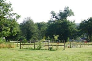
Broderie ou Jardin ? Depuis les premiers pas pour amorcer cette nouvelle broderie, bien des choses se sont passées.Tout d’abord j’étais frustrée de mon matériel
Projet Depuis la Covid il est devenu difficile de se projeter dans le temps. C’est comme si on vivait au jour le jour sans pouvoir
Derniers POints C’est toujours extrêmement dur de terminer une broderie, moralement.J’y vais toujours à reculons car la fin sonne comme un deuil de quelque chose,

Maintenir le Cap Comme la plupart des créatifs je subis mon inconstance, avec des alternances de pics de créativité et des longues plages de récupération.C’est

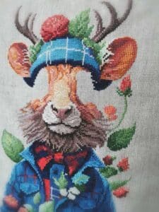
Immersion A peine avais-je terminé Griselda que je trépignais de commencer Seamus.J’ai tellement aimé le travail des écossais sur Polly que j’avais envie d’y regoûter

La Patience « Patience et longueur de temps font plus que force ni que rage » Jean de La Fontaine XXXXXXXXXXX Ainsi Nimue renoua avec ses classiques

Je me suis fait chahutée par Griselda Honnêtement je n’en menais pas large.J’ai douté de moi, de ma capacité à réussir quoi qu’il arrive.Dans ces

Griselda Depuis quelques heures je me suis lancée dans un nouveau sujet : Griselda Première difficulté : les matières !Il y a du satin/soie et de

Prosper : jusqu’à la fin… Après ce que j’ai décrit dans l’épisode précédent j’ai fait une longue pause. Et puis dernièrement j’ai repris l’ouvrage

Prosper : en chemin… Alors que dans le premier article je commençais à peine mon ouvrage, voilà que j’en suis déjà à la fin